
If you haven’t noticed yet, I like making and receiving homemade gifts. There is something special about someone spending time creating something for you that fills your heart with warmth and joy. I love any gift that someone has chosen specifically for me, but I especially love a homemade piece. I went a little crazy this year with homemade gifts for family. Maybe a little overboard. Haha, why not though?
When dad and I had decided to start a shop for our woodworking and were deciding on a name, I made sure to do some research so that we would find something that was not already used, overused or would disappear in search listings. Our first few ideas didn’t pan out due to either already being used or too many similar names coming up in searches. When we decided on M2C1 Kraftwerks, there was nothing else like it. Yes, there are companies that use M2C1, but paired with our quirky “Kraftwerks” we are the only thing that comes up in the search. If you use M2C1 crafts, we are still the main links on the first page of the search. We liked “Kraftwerks” for the quirky spelling but also because we didn’t want to narrow to specifically woodworking. Worked out now that we have incorporated other craft items created by my mother-in-law.
I digress. While doing all that research, one thing that did come up was some funny signs for “Measure Twice, Cut Once”. They were cheeky little signs and I knew immediately that I would need to make one of these glorious jokes as a gift for my dad. I thought it would be fun to incorporate the humour of the sign with our company name.


First thing to do was to plane down a piece of premium pine 1” x 8” down to 1/4” x 8”. I planned to mount it to a piece of 1/4” plywood and my channel in the frame would be 1/2”. I planed down a piece a little longer than needed. I also planed down a piece of 1” x 2” so that it had nice crisp edges for the frame. It ended up being 1/2” x 1-3/8”.


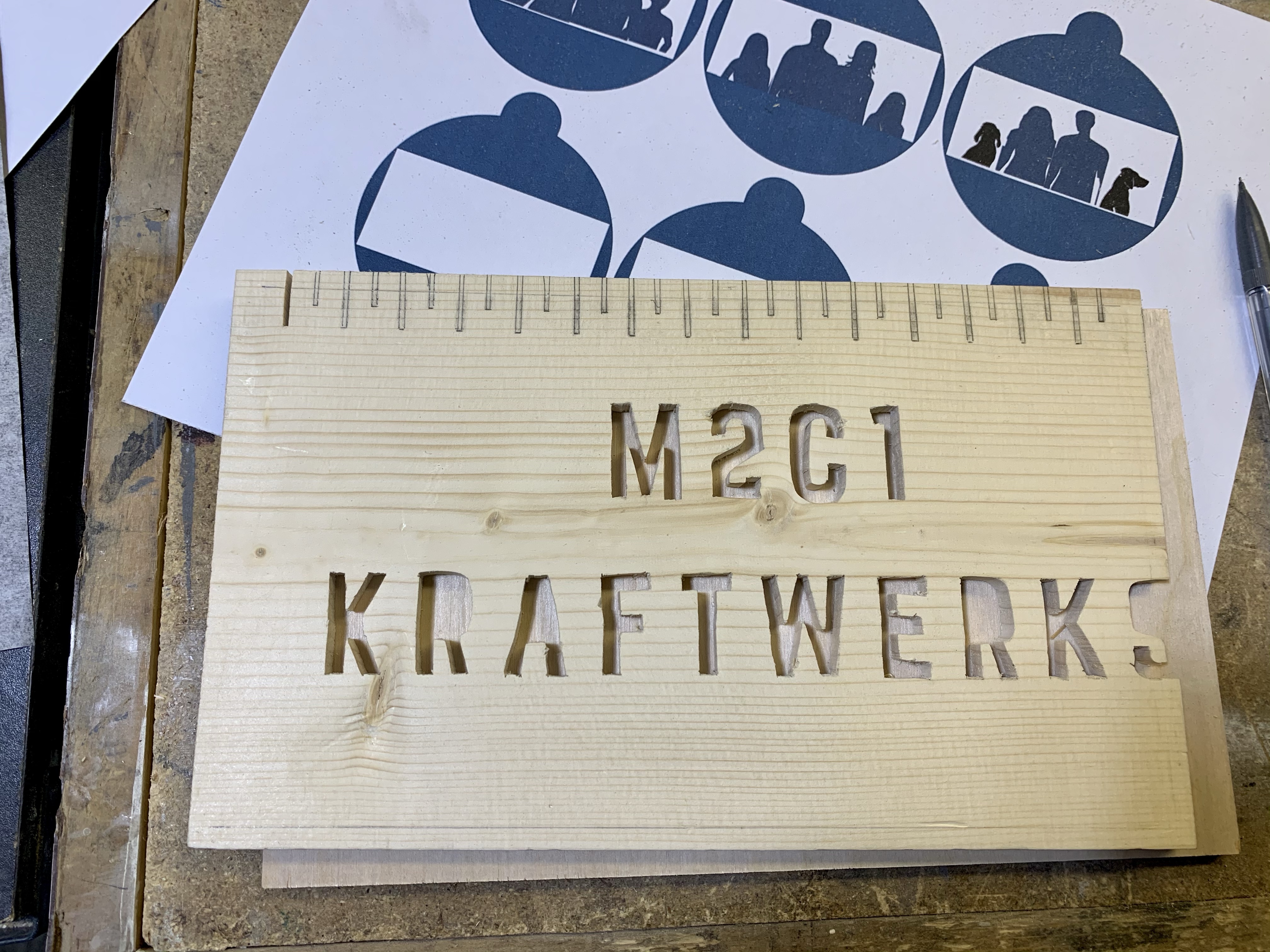
Next, I had come up with a design that I liked and had printed it out so that I could transfer it to the board with carbon paper. When transferring it, I also noted where the frame would sit on the “cut-off” side. I knew my frame channel was going to be 1/4” deep so I marked that for reference. I then cut off the excess section to make it easier for the next step.

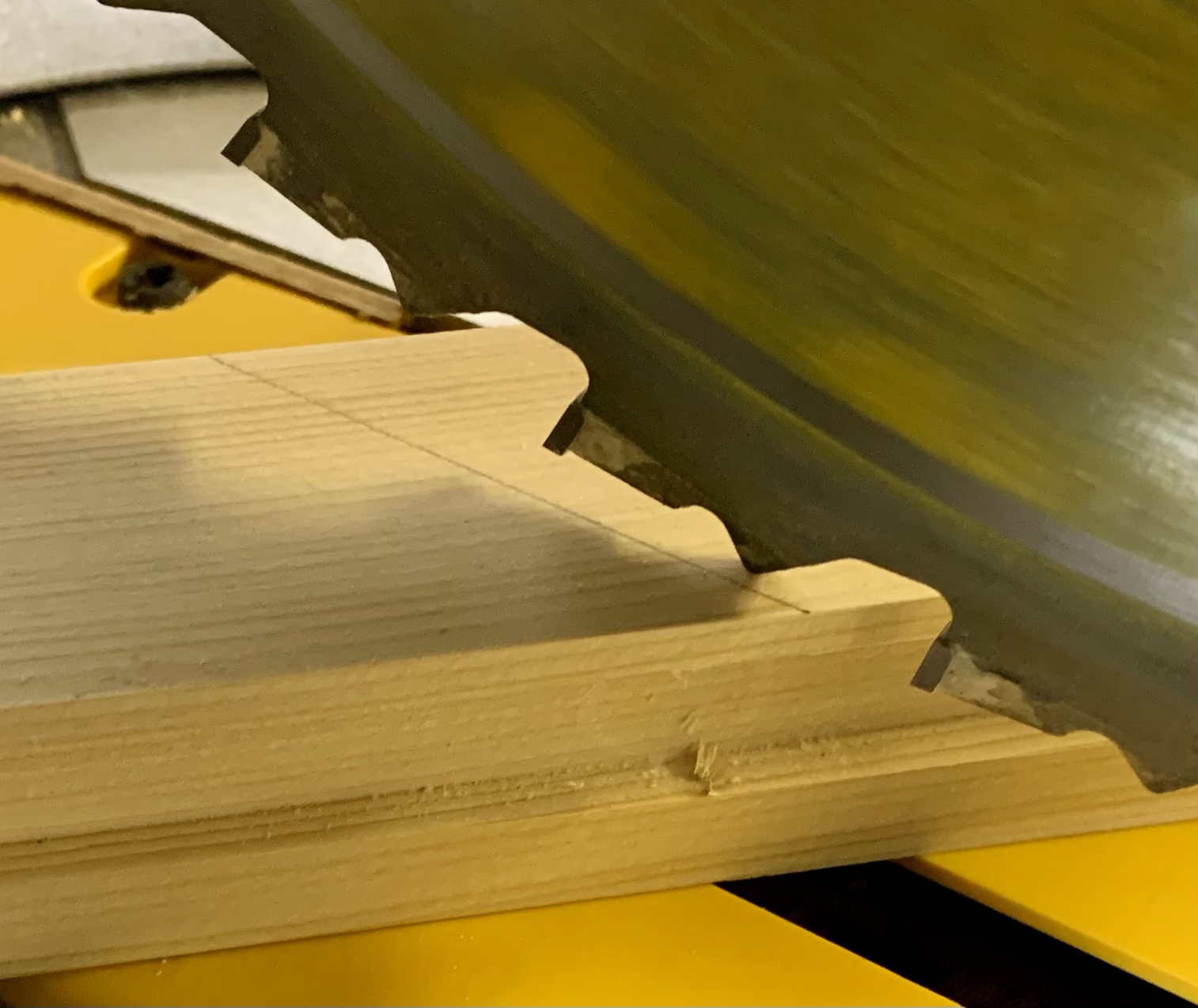
I certainly got a lot of time on my scroll saw in the last month. I feel that I am gaining confidence in what I am able to create as well as the finer details that I am able to handle. The thickness of the lettering that I chose was just wide enough for a pilot hole large enough to thread the blade. Again, I luckily have pin-less blades, so that allows be to go a little finer in my cuts. As I made my way along all the letters, I had to setup a system for the letters that had a “floater” piece. Letters like A and R had pieces that popped out that would later need to be glued back into place. In fear of losing them, I grabbed the initial tracing design and used tape to stick those small pieces into the letters they belonged to, ensuring I wouldn’t accidentally throw them out while cleaning up.
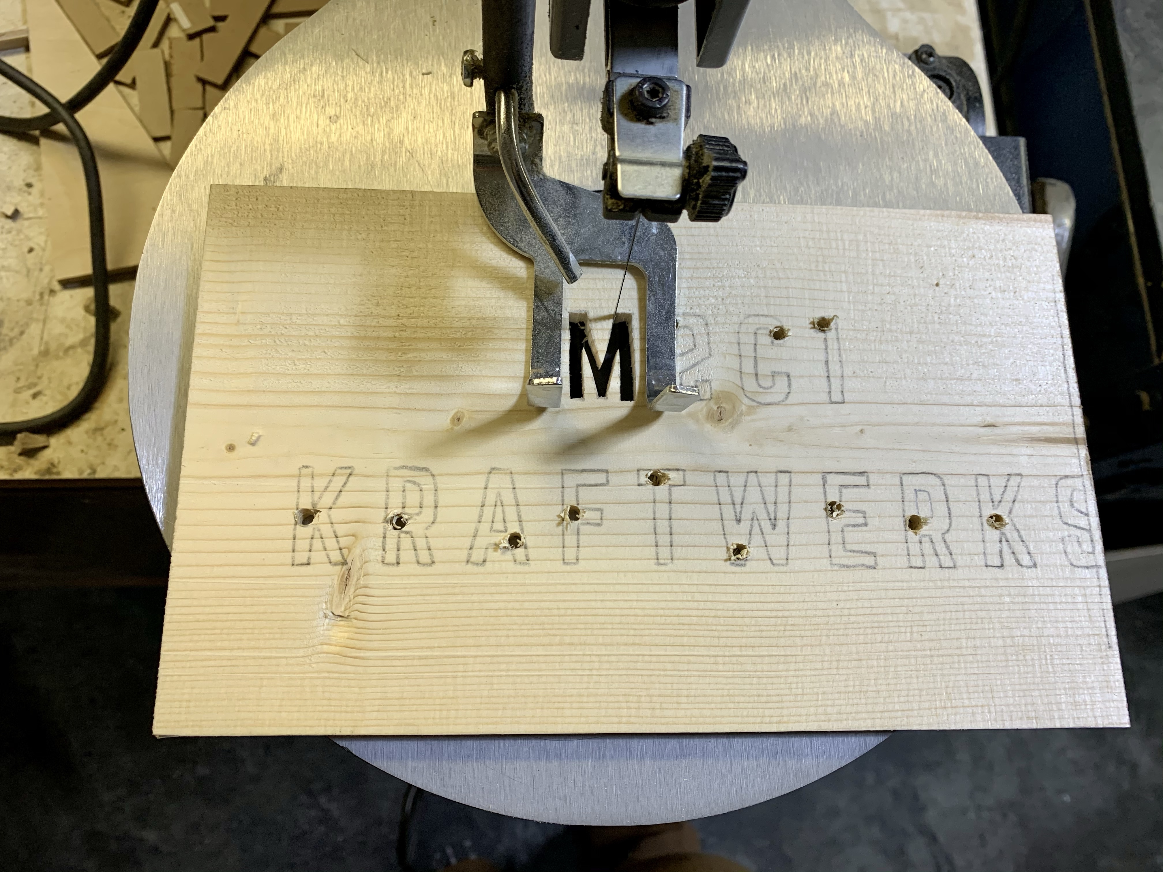


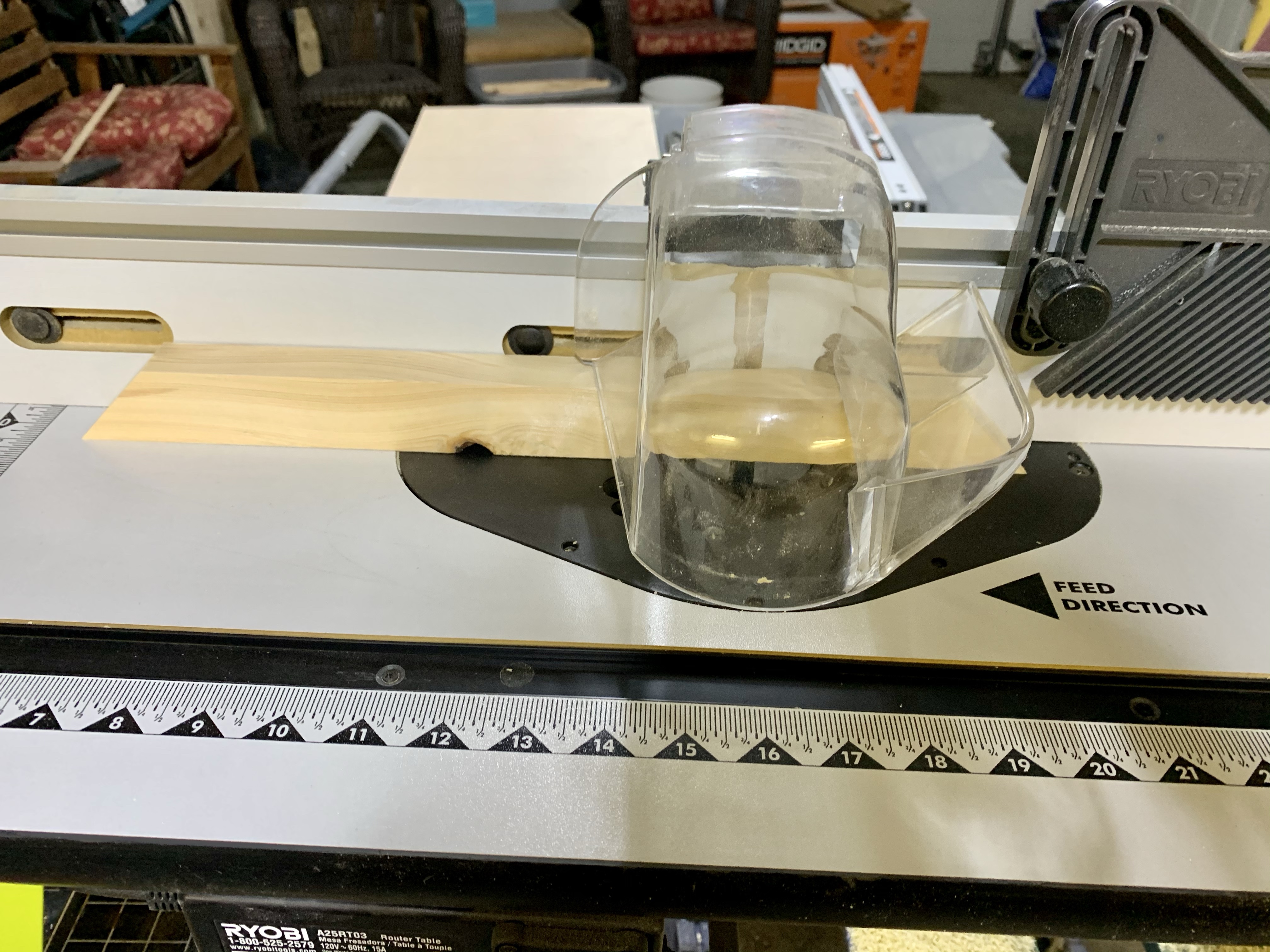
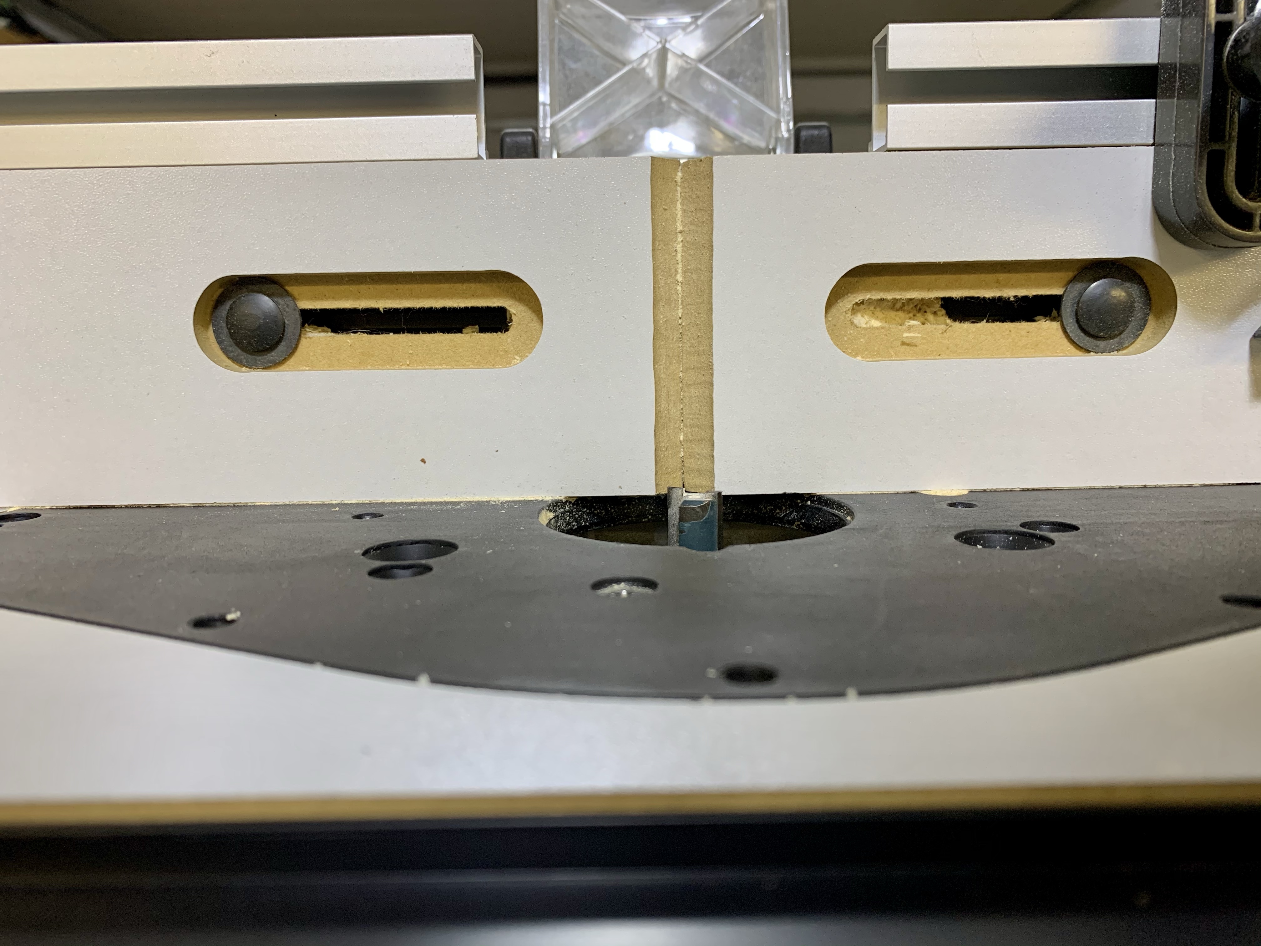
Once I had the lettering in place, my neck and back needed a brake from scroll-sawing so I switched gears and worked on the frame. The first thing I wanted to do was cut the channel that the sign would sit in, into the 1/2” x 1-3/8” wood. Using my router table and a 1/2” straight bit, I am able to create the channel needed. I set my router table so that the front edge of the channel will be at 3/8” into the 1-3/8” side of the wood. The bit is set so the channel will be 1/4” deep.

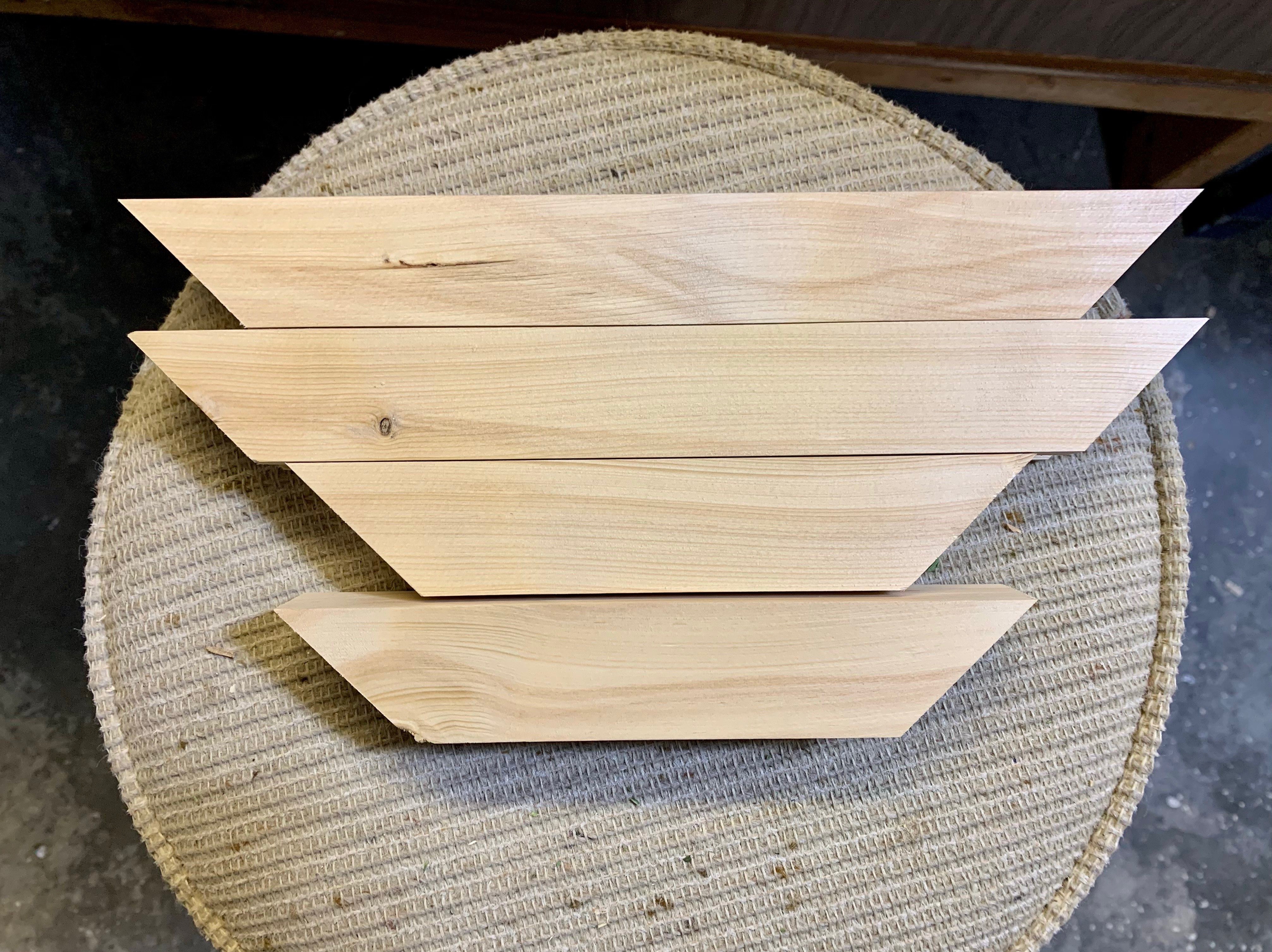
Once my channel was set, I was ready to cut out the frame and things started getting tricky. I’m not sure if I had just been doing too much and my brain was not working at max capacity, but I could not wrap my brain around screwing up the frame. I was sure my measurements were correct for a frame that had a piece that would be too small, but apparently my brain over-rode that decision and I ended up with a perfect frame once I’d cut all the pieces. Ok, no problem. I just cut an extra slice off one of the long edges.
I was again ready to do some more scroll-sawing. This next section was easier as it was just straight lines, but it was tedious with how many I had to do. The final look though was a fantastic addition to the wording and finishing off the look of the design. I did have to make adjustments to my drawing in this when transferring it as I had not accounted for the 1/4” section cut off by the frame. The shorter lines would have just barely poked out, so I drew in my 1/4” line, then traced the measuring tape starting at that line. Worked like a charm.


Now it was time for some paint. I wanted to incorporate the bright yellow and blue of the logo my dad had designed. I chose to do the back panel in the bright blue. I didn’t want the full face-plate in the yellow, so I opted to just paint the inside of the letters with yellow to incorporate that colour. It’s hard to see in the photos but once dry, the yellow really stood out against the blue. I did a clear matte coat on the full sign to seal the wood. The frame I chose to do in Ipswich pine stain for some contrast to the sign.


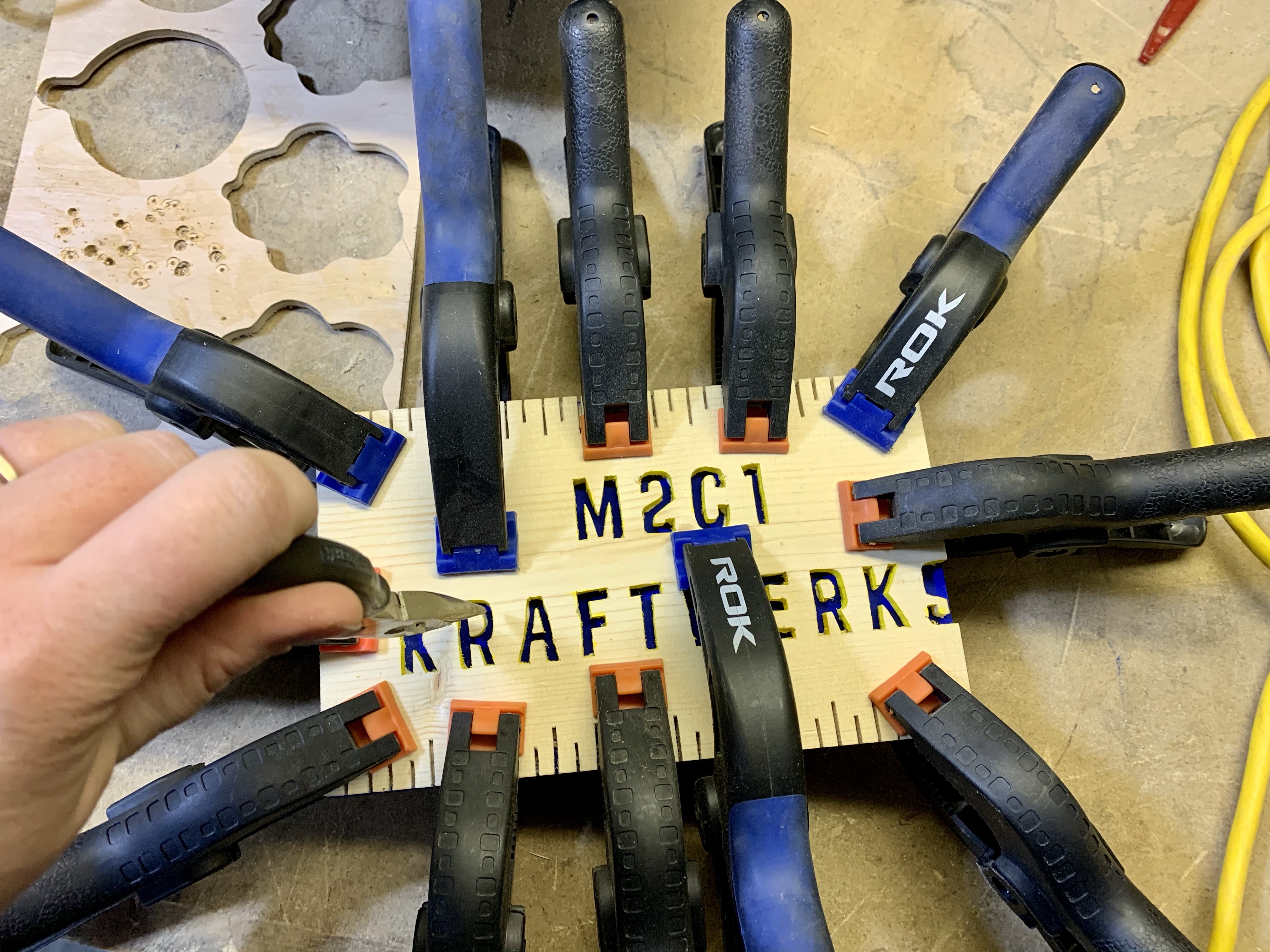
Once everything was dry, it was time to assemble the entire thing. I started by putting a full, thin coat of glue on the back of the front plate. I was careful to keep the glue fairly thin around the lettering so that I wouldn’t have too much, if any, glue squeeze out in those areas. I then used a bunch of clamps to hold it together while it dried. I also added back in the floating pieces of the A and R letters in the name. That was fun. I ended up using some needle nose pliers to get them into proper placement. Voila. I let is sit until the following afternoon to make sure it had a nice solid hold before forcing it into its frames.


I did a quick dry fit and realized that the thickness of the sign was a little too tight for the frame, so I used my belt sander and took just a bit off the back so that it was a secure fit but I didn’t need a hammer to get it into place. I then glued up the frame pieces and assembled. I decided that I liked the look of the bottom piece being centred with a small gap on both sides rather than a large gap. It’s a bit more subtle of a screwed up look, but I thought it looked better with the sign.


The end result was exactly what I had hoped for. I knew that my dad would like it and hoped that my screw ups weren’t too subtle. After chatting with him once he had opened the gift, my screw ups had given him a moment of pause. When he first opened it, he said he thought the sign had slipped so he had tried sliding it to see if it moved back into place. It obviously didn’t. He then thought it was weird that I would have left the frame how it was with such an obvious gap from the bottom piece. It wasn’t like me to leave such an obvious screw up. He then realized the joke of the sign and got a kick out of it. It will have a home in his shop where he makes all of his beautiful carvings.


